
The Member Portal
I was an integral member of a team which launched an ambitious project to build and design a new portal where healthcare consumers would be able to manage their enrollment and billing services. Since the launch of our product in July 2020, we have been proudly serving 13+ clients and helping users with managing their healthcare.
Overview
We worked closely with our clients to design and implement a portal that supports their membership systems and services. Through the new system, members gained the ability to update and view their enrollment and billing information. This included viewing and making payments, viewing eligibility and enrollment notices, linking off to integration points, and performing other online transactions.
Role
I was the lead and solo UX designer for this project. My responsibilities included:
-
Conducting user research and usability testing
-
Creating user flows, personas, journey maps
-
Creating wireframes and prototypes
-
Defining the experience for mobile systems
-
Establishing and standardizing a design system with branding guidelines
-
Presenting research and designs to stakeholders and working with project managers and developers to implement designs
UX Process
Before commencing the design process for the new portal, it was crucial to understand our objectives. With this project, I used the double diamond method as a guide.
User Research
The discover and define phases are crucial to setting the project off in the right direction. During the early phases, I worked with both the internal and external teams to understand key business objectives and desired outcomes. I performed exploratory research to learn about the problem and opportunity space. I liaised with stakeholders and end users to understand the company’s vision for the new portal and how we can make a difference in optimizing pain areas. The following key points guided us in the process:
-
Who are our users and what do they need, desire, and value from this product?
-
What are we looking to achieve with this product?
-
What does success look like?
-
What are the features we must implement for the product’s first release?
-
What are our technical and resource limitations?
Use Cases
Meetings with the internal and external teams were held on a weekly basis. This helped to create alignment on the objectives, encouraged a shared vision between the multidisciplinary teams, and drove decision making. We defined the requirements and use cases and established features that will be included in the new portal.
Design Goals
These were the high-level goals that guided my design strategy:
-
Ease of use and accessibility for all users.
-
Personalization of content and adaptability for consumer’s individual needs
Using the insights I gathered from user research, I created personas for the multiple user types, user flows, and journey maps.
Personas


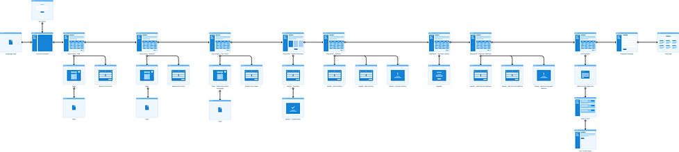
User Flows

Ideation & Communicating Designs
We adhered to a top-down approach to defining the overall structure and flow of the experience and my ideation process involved high-level sketches for the primary use cases. Sketching by pen and paper enabled me to brainstorm and visualize my ideas and encouraged creative thinking.
Once we decided on the visual direction of the layout, I digitized my sketches in Sketch. The designs were shared with stakeholders and team on a weekly basis to obtain feedback on the functionality and interactivity of the product.
Once we had approval of the flow and content, we then used Marvel to create prototypes.

Usability Testing
Usability tests were conducted at various stages of the project. The tests were conducted with the help of a third-party due to limited resources and time. In our initial testing, low-fidelity prototypes were used with health care consumers to ensure that the tool meets users’ needs and expectations.
Research Questions
-
To what extent do participants find key features and functions easy to find and use?
-
To what extent does the organization and categorization of the tool’s items meet users’ expectations?
1-hour remote usability testing sessions were conducted with 8 health care consumers, ages varying from 22 to 64. 5 participants viewed the desktop version of the prototype and 3 participants viewed the mobile version of the prototype. Participants were given a set of activities to complete on the low-fidelity prototype.
Each session focused on gathering:
-
Impressions of the account landing page
-
Ways that participants interacted with the tool while completing tasks
-
Reflections on participants’ experiences using the prototype
For each feature, feedback was collected and several iterations were made on the designs throughout the product life cycle. We went through cycles of requirements, consensus, approvals, details specifications, and handoffs.
Development
During development, I worked closely with the developers to clarify any doubts on the features that I implemented and provided guidance on the hand-off specifications.
Style Guide
As I started transitioning into high-fidelity designs, I also worked on creating a style guide that would serve as a guideline to ensure that we as a company implemented a consistent design system across the different products we were building.
-
Typography and font
-
Color palette
-
UI components

Accessibility
We ensure our products are WCAG 2.0 AA compliant and users are able to accomplish tasks that they set out to perform. Designing for accessibility, diversity, and inclusion are crucial and I make sure that we keep these questions in mind during planning, designing, and developing:
-
Is there sufficient contrast in the design for users who are visually impaired?
-
Is it responsive and can I access what I need on different devices?
-
Is there a clear content hierarchy?
-
Is it keyboard friendly?
Challenges
The biggest challenge I faced throughout this project was the limited time and resources for user research and testing. We did not have a clear UX process so I invested in building research capability, gathering as much information as I could asking questions, interviewing stakeholders, and setting up weekly brainstorming and design sessions with the team. The scope of the project was also constantly changing and I had to adapt to those changes while also balancing moving forward with designs.
Branding was also another challenge. We did not have a style guide that we could use so that was something I also worked on creating in parallel with the new member portal project.
Learnings
This was a really engaging project for me to work on and was a tremendous learning experience. Some things I learned from this experience include:
Prioritization
Have a plan and prioritize features. This helps deal with out-of-scope requests that could potentially derail the project.
Research
Take time for research and get feedback early and often. This saves time and re-work.
Advocate for better UX practices
Make people more aware of the importance and benefits of user-centric designs.
The Launch and Next Steps
After nearly a year of design and development, we completed the first phase and launched our new member portal in early July of 2020.
The Impact
It was great to see my work brought to life and the impact it continues to have on users.
The member portal continues to evolve and we are always looking to improve and enhance our designs and user experience. We are actively monitoring for any bugs and issues users may encounter. My involvement in this product continues and I have already started working on enhancements for Member Portal 2.0. I am excited to take what we have accomplished to the next level and I look forward to continuing working with the team on implementing phase II in late 2022.
